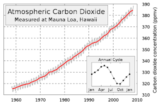
Now understand, this chart is accurate. The CO2 concentration in parts per million (ppm - often expresed as parts per molar volume, ppmv, which means the same thing) is clearly labeled along the right side of the chart. The years are shown along the bottom in increments of ten years. The chart is subdivided by grey dotted lines, called grid lines, to better pinpoint where on the chart's body the data points are located. For example, to find out what the CO2 level was in 1970, you simply trace up the grid line labeled 1970 to the point where it intersects the red line, which is about halfway between the two horizontal grid lines labeled 320 and 330. This tells you that in 1970 the CO2 concentration in the atmosphere was about 325 ppmv. Likewise, if you want to know, for example, when the CO2 concentration reached 360 ppmv, you follow the grid line left from where it's labeled "360" and you find it intersects the red line about halfway between the two grid lines labeled "1990" and "2000". This tells you that the CO2 count hit 360 ppmv in about 1995. Simple enough.
This chart is the most widely used chart by the anthropogenic global warming proponents to scare the bejesus out of you. But when you look at the range, where the numbers start and where they end, you'll notice that the lowest values (the baseline)represented are 310 ppmv and the year 1960, which was soon after data collection by Dave Keeling began. However, there are other ways of looking at this same data that are just as accurate but give a slightly less drastic picture of what's happening. Here's a chart that covers the same time period - 1960 to the present - but the ppm range starts at zero ppm, not 310 ppmv. Check this out:

The reason this chart looks different is because the CO2 concentration is expressed as the total concentration of CO2 in the atmosphere, not just the concentration of CO2 compared to where it was in 1950 and using that concentration as the “floor” of the chart rather than the true floor of zero.
Looking at the second chart, you can see that the data range
covers only a little under two of the nine horizontal intervals. That translates to an increase of about 24% since Keeling started keeping meticulous records of CO2 levels more than fifty years ago. But when you look at the Keeling chart, it looks like the concentration of CO2 has gone up nearly 100%, not 24%. Nevertheless, in the grand scheme of things, the CO2 concentration of 390 ppmv has increased 39% since the beginning of the industrial era.
In defense of the Keeling chart, it does represent a zoomed-in view of the trend which allows one to more precisely locate CO2 concentrations at specific times in history.
Now, in the grand scheme of things, exactly how does a CO2 count of 390 ppmv stack up against where it was during other periods in Earth's history? Here's a chart showing CO2 and oxygen (O2) concentrations in the atmosphere, along with the Earth's temperature during the last 600 million years.

As the legend shows, the olive CO2 line and the red oxygen (O2) line express values as ratios, or multiples of the concentrations of these gasses compared to today’s values, which are expressed as the straight blue line along the bottom. So you can see that 500 million years ago the CO2 concentration was sixteen times higher than it is today. Similarly, atmospheric oxygen was only at about 8% 500 million years ago, or 40% of the oxygen component of our atmosphere as it stands today, which is 21%. But the purple temperature line is different. It does not say that the earth was seven times hotter 500 million years ago – it says it was seven degrees warmer, or about 21° C. This chart greatly magnifies the temperature trends over time. Now, the advantage of this format is that temperature trends can easily be seen to follow the CO2 trends. Temps are high when CO2 is high – when CO2 concentrations drop, temperatures drop with it. If you want to clearly express these trends, this is the type of chart you want to use.
But what if we express temperature over time in ratio form with respect to the current temperature of 14° C? If we did that, it would look like this:

The data itself may not be lying, but the presenter can, and often does, distort what the data actually says. This is especially true when politicians want to manipulate their audience so they can get a political advantage or when scientists want to manipulate a lay audience to believe they have established some kind of profound truth. Even when the data doesn’t lie, one can sway people’s opinions on a massive scale. It gets worse when politicians and scientists use false data (the infamous “Hockey Stick” comes to mind) to get people to believe a lie. The point of all this is this: The manner in which data is presented has an effect on how the observer interprets it. Please see my next installment (CLCC - 5) where I discuss the "Hockey Stick" and how this false chart came to be.

No comments:
Post a Comment