SCIENTIFIC CHARTS: WHAT DO THEY REALLY TELL US?
In Part 1 of this series (CLCC - 1), I included a chart of the Keeling Curve that clearly shows how the CO2 levels in the atmosphere are rapidly increasing. Here it is again.
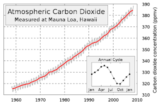
This chart is the most widely used chart by the anthropogenic global warming proponents to scare the bejesus out of you. But when you look at the range, where the numbers start and where they end, you'll notice that the lowest values (the baseline)represented are 310 ppmv and the year 1960, which was soon after data collection by Dave Keeling began. However, there are other ways of looking at this same data that are just as accurate but give a slightly less drastic picture of what's happening. Here's a chart that covers the same time period - 1960 to the present - but the ppm range starts at zero ppm, not 310 ppmv. Check this out:

This chart shows the same curve, made up of the same data, but it depicts the same information from a "big picture" or a "zoomed out" perspective. We can see the CO2 concentration in the atmosphere is definitely increasing, and the slight upward curvature indicates an accelerating accumulation of CO2. It's really just like the Keeling chart, only not as dramatic in appearance.
The reason this chart looks different is because the CO2 concentration is expressed as the total concentration of CO2 in the atmosphere, not just the concentration of CO2 compared to where it was in 1950 and using that concentration as the “floor” of the chart rather than the true floor of zero.
Looking at the second chart, you can see that the data range
covers only a little under two of the nine horizontal intervals. That translates to an increase of about 24% since Keeling started keeping meticulous records of CO2 levels more than fifty years ago. But when you look at the Keeling chart, it looks like the concentration of CO2 has gone up nearly 100%, not 24%. Nevertheless, in the grand scheme of things, the CO2 concentration of 390 ppmv has increased 39% since the beginning of the industrial era.
In defense of the Keeling chart, it does represent a zoomed-in view of the trend which allows one to more precisely locate CO2 concentrations at specific times in history.
Now, in the grand scheme of things, exactly how does a CO2 count of 390 ppmv stack up against where it was during other periods in Earth's history? Here's a chart showing CO2 and oxygen (O2) concentrations in the atmosphere, along with the Earth's temperature during the last 600 million years.
The numbers on the left represent multiples of today’s concentrations while the numbers along the bottom represent intervals of 50 million years. The legend on the right color-codes the data and stipulates the method in which the data is expressed.
As the legend shows, the olive CO2 line and the red oxygen (O2) line express values as ratios, or multiples of the concentrations of these gasses compared to today’s values, which are expressed as the straight blue line along the bottom. So you can see that 500 million years ago the CO2 concentration was sixteen times higher than it is today. Similarly, atmospheric oxygen was only at about 8% 500 million years ago, or 40% of the oxygen component of our atmosphere as it stands today, which is 21%. But the purple temperature line is different. It does not say that the earth was seven times hotter 500 million years ago – it says it was seven degrees warmer, or about 21° C. This chart greatly magnifies the temperature trends over time. Now, the advantage of this format is that temperature trends can easily be seen to follow the CO2 trends. Temps are high when CO2 is high – when CO2 concentrations drop, temperatures drop with it. If you want to clearly express these trends, this is the type of chart you want to use.
But what if we express temperature over time in ratio form with respect to the current temperature of 14° C? If we did that, it would look like this:
Now we have a whole different picture. With the notable exception of CO2, which is still up in the stratosphere, all the other parameters are hugging the blue line - including the purple temperature line. The expression of temperature as a ratio brings it in line with the other parameters - the temp never gets above one and a half magnitudes of the current temperature. So if I wanted to lead someone to believe that carbon dioxide has minimal effect on temperature, I'd show them this chart.
The data itself may not be lying, but the presenter can, and often does, distort what the data actually says. This is especially true when politicians want to manipulate their audience so they can get a political advantage or when scientists want to manipulate a lay audience to believe they have established some kind of profound truth. Even when the data doesn’t lie, one can sway people’s opinions on a massive scale. It gets worse when politicians and scientists use false data (the infamous “Hockey Stick” comes to mind) to get people to believe a lie. The point of all this is this: The manner in which data is presented has an effect on how the observer interprets it. Please see my next installment (CLCC - 5) where I discuss the "Hockey Stick" and how this false chart came to be.
THE BIRTH OF MODERN CLIMATE SCIENCE
Roger Revelle was an oceanographer and earth scientist who was instrumental in advancing the field of oceanography as a leading earth science during the post World War II era. He helped to found the International Geophysical Year (IGY) in 1958, which led to the creation of NASA, and the establishment of a cluster of South Pole research stations staffed with scientists from all over the developed world. Other discoveries by earth scientists involved with IGY were the Earth’s magnetosphere and the Van Allen radiation belts, and the mid-ocean ridges, which in turn led to the confirmation of plate tectonics and the ability to map the positions of the continents throughout Earth’s history.
Part of Roger Revelle’s activities as an oceanographer was the study of ocean chemistry and the development of an understanding of the ocean’s role as a carbon dioxide (CO2) sink. He concluded that the speed of the ocean’s ability to dissolve atmospheric carbon dioxide was determined by its temperature and alkalinity, and that an equilibrium back pressure had to be overcome in order to dissolve the increasing amount of carbon dioxide accumulating in the atmosphere due to natural processes such as volcanism and to anthropogenic sources such as the increased burning of fossil fuels to support the burgeoning population of the world. Thus, in the late 1950s, was born the science of anthropogenic climate change. A further note: A young Al Gore took a course taught by Revelle at Harvard in the late 1960s when Revelle was a visiting professor there. The seed for the eventual movie An Inconvenient Truth was planted in Al Gore's mind back in that Harvard classroom some forty years ago.
Under Revelle’s directorship and with IGY funding, the Scripps Institute of Oceanography (SIO) hired a young oceanographer and geoscientist named Charles David (Dave) Keeling in the mid to late 1950s to keep track of the build-up of carbon dioxide from a newly established SIO outpost on Mauna Loa in Hawaii. From this station high up on Mauna Loa far away from point sources of carbon dioxide emissions, such as smokestacks, factories, and power generating facilities, and upwind of the active volcano at Mauna Loa (occasionally wind shifts cause elevated readings of volcanic carbon dioxide, but these anomalous readings are filtered out of the permanent record). During the decades that followed the establishment of the SIO outpost the daily soundings for atmospheric carbon dioxide content have been entered into a continuous record known as the Keeling Curve. The curve consists of a red line (the mean) drawn through a wavy, up and down pattern that reflects the seasonal variations of CO2 over the course of each year. Over the decades since this project was initiated, the curve is clearly showing that the accumulation of carbon dioxide in the atmosphere is accelerating.
In addition to the long term increase in atmospheric carbon dioxide, Keeling’s equipment also registered some short-term phenomena which became apparent over the course or the first days, weeks, and months of the study - the diurnal variation of CO2 in the air due to plants photosynthetically taking up the gas during the day and their discharge of it at night while respiring (breathing). A further seasonal variation appeared over the months that showed decreased CO2 level due to increased aggregate photosynthesis during the summer months in the Northern Hemisphere, where most of the Earth’s continental land mass (with its rain forests, jungles, farmlands, golf courses, etc.) is located. In Northern Hemisphere winters, where the nights are long, the days short, and many trees are devoid of leaves, photosynthetic activity decreases significantly as plants respire like animals and contribute their fair share of CO2 to the atmosphere. These are the little up-and-down grey squiggles you can see when you look closely at the Keeling Curve. The squiggles go up during the Northern winters and down after the Northern summers arrive. These phenomena were either unknown or rarely thought about by geoscientists before Keeling came along.
Here is a look at the standard Keeling Curve:
Note the red line superimposed on the squiggly grey seasonal variations of CO2. The seasonal CO2 variation over one year's time is presented in zoom view in the lower right corner of the chart.
Finally, there are some aspects of this chart I will discuss in more detail in an upcoming installment in this series. Stay tuned.


